101 ways to (ab)use a checkbox
Ryan Seddon

The checkbox is pretty boring...
Incorrect!

+ :checked = Awesome
Custom checkboxes/radios
Pretty simple CSS
<input type="radio" name="opts" id="opts1">
<label for="opts1">Option</label>
Setup the styles to react to label clicks
input + label {
 background-position: 50px 0;
}
input:checked + label {
 background-position: 0 0;
}
input:checked ~ input + label {
 background-position: -50px 0;
}
Shiny dot is a CSS gradient
input + label {
    /* less interesting styles */
    background-image: radial-gradient(hsla(200, 100%, 90%, 1) 0%,
                        hsla(200, 100%, 70%, 1) 15%,
                        hsla(200, 100%, 60%, 0.3) 28%,
                        hsla(200, 100%, 30%, 0) 70%);
    border-radius: 25px;
    box-shadow: hsla(0, 0%, 100%, 0.15) 0 1px 1px,
                inset hsla(0, 0%, 0%, 0.5) 0 0 0 1px;
    transition: background-position 0.15s cubic-bezier(0.8, 0, 1, 1);
}
I wrote an article about the technique
Tree menu
Tree markup
<ol>
  <li>
    <input type="checkbox" checked id="folder1" />
    <label for="folder1" onclick>Folder 1</label>
    <ol>
       <li>File</li>
    </ol>
  </li>
  ... more items
</ol>
CSS, heavily simplified
.tree li input:checked ~ ol {
    height: auto;
    padding: 0 0 0 35px;
}
.tree li label:after, .tree li label:before,
.tree li input:checked ~ ol:before {
    background: url(icon-sprite.png) 0 0 no-repeat;
    content: "";
    height: 14px;
    width: 14px;
}
.tree li input ~ ol > li { display: none; }
.tree li input:checked ~ ol > li { display: block; }
I wrote an article on this too!
Lets step it up a notch
Introducing Bootleg.css, a
dodgy version of Bootstrap
Button groups
Button groups with radios
Button groups markup
<div class="btn-group" data-toggle="buttons-checkbox">
  <input type="checkbox" id="group1" data-toggle="button">
  <label class="btn btn-primary" for="group1">Left</label>

  <input type="checkbox" id="group2" data-toggle="button">
  <label class="btn btn-primary" for="group2">Middle</label>

  <input type="checkbox" id="group3" data-toggle="button">
  <label class="btn btn-primary" for="group3">Right</label>
</div>
Button groups markup radios
<div class="btn-group" data-toggle="buttons-radio">
  <input type="radio" id="r1" name="r-group" data-toggle="button">
  <label class="btn btn-primary" for="r1">Left</label>

  <input type="radio" id="r2" name="r-group" data-toggle="button">
  <label class="btn btn-primary" for="r2">Middle</label>

  <input type="radio" id="r3" name="r-group" data-toggle="button">
  <label class="btn btn-primary" for="r3">Right</label>
</div>
Button groups CSS
input[data-toggle]:checked + label,
input[data-toggle]:checked + label:active {
    background-color: #0044CC;
    color: #FFFFFF;
    background-image: none;
    box-shadow: 0 2px 4px rgba(0, 0, 0, 0.15) inset,
                0 1px 2px rgba(0, 0, 0, 0.05);
    outline: 0 none;
}
Button groups CSS
.btn-group > .btn:first-of-type {
    border-bottom-left-radius: 4px;
    border-top-left-radius: 4px;
    margin-left: 0;
}
Dropdowns
Dropdown markup
<ul class="nav" role="navigation">
  <li class="dropdown">
    <input type="radio" name="dropdowns" id="dropdown1">
    <label for="dropdown1" class="dropdown-toggle" onclick>
        Dropdown
        <b class="caret"></b>
    </label>

    <ul class="dropdown-menu" role="menu">
      <li><a tabindex="-1" href="#">Action</a></li>
      ... more items
    </ul>
    <label for="dismissdd" class="dismiss-dd" onclick></label>
  </li>
</ul>

<input type="radio" checked id="dismissdd" name="dropdowns">
Dropdown CSS
#dropdowns input[type="radio"] ~ .dismiss-dd {
    display: none;
    position: fixed;
    top: 0;
    right: 0;
    bottom: 0;
    left: 0;
    z-index: 999;
    padding: 0 !important;
    background: transparent !important;
    line-height: 0;
    cursor: default;
}

#dropdowns input[type="radio"]:checked ~ .dropdown-menu,
#dropdowns input[type="radio"]:checked ~ .dismiss-dd {
    display: block;
}
Collapse
Collapse markup
<input type="radio" name="accordion-group" id="collapseAll">
<div class="accordion-group">
  <input type="radio" id="collapse1" name="accordion-group" checked>
  <label for="collapseAll" class="accordion-dismiss"></label>

  <div class="accordion-heading">
    <label for="collapse1" class="accordion-toggle">Heading #1</label>
  </div>
  <div id="collapseOne" class="accordion-body collapse">
    <div class="accordion-inner">
      ...
    </div>
  </div>
</div>
Collapse CSS
#collapse .accordion input ~ .collapse {
    max-height: 0;
    height: auto;
    transition: max-height 0.2s ease 0s;
}
#collapse .accordion input:checked ~ .collapse {
    max-height: 500px;
    transition-duration: 0.7s;
}
Modals
Modal markup
<!-- Modal 1 -->
<label class="btn" for="modal1" onclick>Launch ze modal</label>
<input type="radio" id="modal1" name="modal" />
<div class="modal hide fade">
<div class="modal-header">
<label role="button" class="close" for="closemodal">×</label>
<h3>Modal header</h3>
</div>
<div class="modal-body">...</div>
<div class="modal-footer">
<label role="button" class="close" for="closemodal">Close</label>
</div>
</div>
<!-- Overlay and close -->
<input type="radio" id="closemodal" name="modal" />
<label for="closemodal" class="modalclose"> </label>
Modal CSS trigger
#modals input + .modal {
    left: 50%;
    margin: 0;
    top: 0;
    opacity: 0;
    transition: transform 0.3s ease-in, opacity 0.3s linear;
    transform: translate(-50%,-100%);
}
#modals input:checked + .modal {
    opacity: 1;
    transition-delay: 0.4s;
    transform: translate(-50%,20%);
}
Modal closing CSS
#modals input + .modalclose {
    transition: opacity 0.3s linear;
    position: fixed;
    top: 0;
    left: 0;
    bottom: 0;
    right: 0;
    z-index: -1;
    opacity: 0;
}
#modals input:not(#closemodal):checked ~ .modalclose {
    opacity: 0.8;
    z-index: 1;
    background: #000;
    margin: 0 !important;
    transition-delay: 0;
}
Carousel
Carousel markup
<input type="radio" id="slide1" name="slider" checked>
<input type="radio" id="slide2" name="slider">
<input type="radio" id="slide3" name="slider">
<input type="radio" id="slide4" name="slider">
<input type="radio" id="slide5" name="slider">
Carousel markup part 2
<div class="slides">
  <div class="carousel-inner">
    <div class="item">
      <img src="..." alt="">
      <div class="carousel-caption">
        <h4>Pic 1</h4>
        ...
      </div>
    </div>
</div>
Carousel markup part 3
<div id="controls">
<label for="slide1">
<span>‹</span><span>›</span>
</label>
<label for="slide2">
<span>‹</span><span>›</span>
</label>
<label for="slide3">
<span>‹</span><span>›</span>
</label>
</div>
Carousel CSS
We'll step through the CSS file to better explain
Quirks and bugs
Webkit couldn't handle the hotness
// Off
input[type="checkbox"] ~ div {
    // Fancy styles
}

// On
input[type="checkbox"]:checked ~ div {
    // Fancy styles
}
Prior to Safari 5.1 & Chrome 13 this didn't work
<=iOS5 Safari requires onclick attribute
<input type="checkbox" id="foo">
<label onclick="" for="foo">I need an onclick in iOS</label>
<=iOS5 will not update a checkboxes state when
touching a label, but adding an onclick attribute works.
Notorious 300ms delay iOS
Click events have a 300ms delay. Tapping a label, inputs is sluggish.
Can be fixed using JavaScript and touch events.
Downsides

Accessibility abuse
Confusing markup when consumed through a screenreader
Accessibility experts reaction

Sometimes* require specific placement of markup
* and by sometimes I mean most of the time...
E.g. bootleg tabs
<input type="radio" id="foo" name="tabs">
<label onclick for="foo">Foo</label>

//... more tabs

<div class="tabs-container">
    <div class="tab">...</div>
    //... more tab content
</div>
Limited feature set.
Browser support

| Basic: | ||||
|---|---|---|---|---|
| Firefox | Chrome | Opera | Safari | IE |
| 1+ | 2+ | 9.2+ | 3.2+ | 9+ |
| Fancy: | ||||
| 16+ | 22+ | 12+ | 6+ | 10+ |
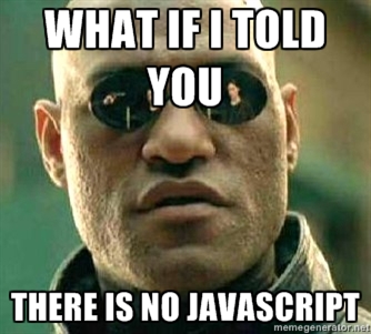
Why not just use JavaScript?
It's fun to experiment
It makes you better at what you do
It feels good to push the limits
Find bugs, file bugs! Makes everyone better off

The future?

A proposal to introduce togglability to any element
.modal-button {
    toggle-states: 2; // How many states
}
// An element with 2 or greater toggle states
// can react to the :checked pseudo-class
.modal-button:checked ~ .modal {
    // show modal
}
Proposed properties
toggle-states
toggle-group
toggle-share
toggle-initial
Recap!
Understand the language
Become a better developer
Find holes
File bugs
Happy dance

And remember...
So use wisely
Thanks!
Slides: cssn.in/ja/cssdevconf
Bootleg: github.com/ryanseddon/bootleg